Klaviyo Flow Analytics Dashboard Strategy
Klaviyo's Flow Analytics Dashboard gives retention marketers something that didn't exist before: a single view that shows every automated flow's revenue, conversion rate, and delivery performance — comparable across channels and time periods. Most brands have the tool but aren't using it strategically. Here's how to turn it into a systematic revenue-recovery machine.
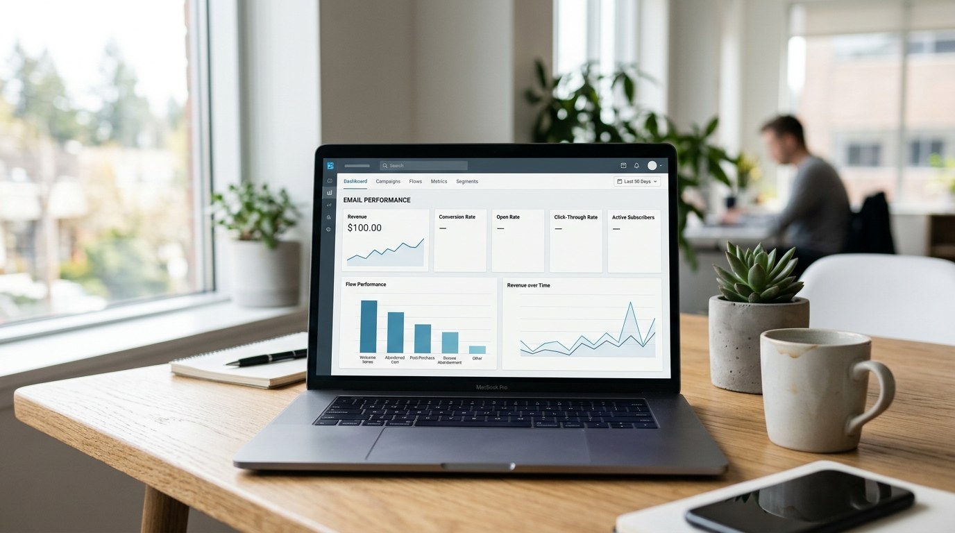
Table of Contents
TL;DR — Key Takeaways
- The Klaviyo Flow Analytics Dashboard centralizes flow revenue, conversion rate, and channel performance in one view with period-over-period comparison
- Flow Analyst benchmarks draw from 196,000+ brands — use them to quickly identify underperforming sequences
- Abandoned cart flows average 5–10% recovery; top performers exceed 15% — that gap is usually fixable with timing and messaging changes
- The 4 flows that leak the most revenue: welcome series, browse abandonment, cart abandonment, and win-back
- Email marketing delivers $36–42 ROI per $1 spent for ecommerce — the dashboard tells you where that ROI is being left on the table
What's New in Klaviyo's Flow Analytics Dashboard
The klaviyo flow analytics dashboard guide starts with understanding what the tool actually does differently from the old per-flow reporting view.
Previously, you had to open each flow individually to see its metrics. Comparing your welcome series against your cart abandonment flow meant juggling multiple tabs and exporting CSVs. The new dashboard consolidates all of that into one workspace — with filters by channel (email, SMS, push), date range, and flow type.
The three additions that matter most:
Period-over-period comparison. You can now set a primary date range and a comparison period side by side. A flow that drove $12,000 last month but only $8,000 this month is immediately visible — you don't need to calculate it manually.
Cross-channel revenue attribution. If your cart abandonment sequence has both email and SMS steps, the dashboard breaks down revenue contribution by channel. This matters because SMS often drives a disproportionate share of recovery revenue in shorter time windows, and that was invisible before.
Flow Analyst benchmarks. This is the feature most brands haven't noticed yet. Klaviyo now surfaces industry benchmarks — drawn from 196,000+ brands on the platform — directly alongside your metrics. Your open rate, conversion rate, and revenue per recipient are shown in context, not in isolation.
The 5 Metrics That Actually Predict Revenue Recovery
Not all Klaviyo metrics are equal. These five are the ones worth tracking closely in the flow analytics dashboard.
1. Revenue Per Recipient (RPR)
RPR is the cleanest measure of how much each flow actually earns. It factors out list size differences — a flow sending to 500 people with an RPR of $4.20 is outperforming one sending to 5,000 people at $0.80.
Track RPR by channel and by individual email step within a flow. If your second cart abandonment email has a much lower RPR than the first, that's a sequencing problem, not a flow problem.
2. Conversion Rate by Step
The dashboard shows conversion rate at the flow level, but drilling into step-level data reveals where shoppers are dropping off. A 12% open rate on email step 3 with a 0.4% conversion rate suggests the offer or CTA isn't landing — not that the timing is wrong.
3. Delivery Rate
Delivery rate drops often go unnoticed until they cause revenue declines. If a flow's delivery rate falls from 97% to 89%, you've silently lost coverage on 8% of your audience. Common causes: list churn, suppressed contacts, or SMS number deactivations.
4. Period-Over-Period Revenue Change
Set your comparison window to the prior 30 days. Any flow showing more than a 15% revenue decline deserves investigation before assuming it's seasonal.
5. Click-to-Conversion Rate (Not Just Click Rate)
Click rate tells you about email engagement. Click-to-conversion tells you about landing page and offer performance. If click rate is healthy but conversion rate is low, the issue is downstream from Klaviyo — your PDP, offer structure, or checkout friction.
Benchmarking Your Flows Against 196,000 Brands
Klaviyo's Flow Analyst benchmarks are one of the most underused features in the platform. Here's how to read them productively.
The benchmarks are segmented by industry vertical and GMV tier. An ecommerce brand doing $2M/year is benchmarked against similar-sized brands in the same category — not against enterprise retailers with dedicated CRM teams and unlimited send budgets.
| Flow Type | Average Conversion Rate | Top Performer Threshold |
|---|---|---|
| Welcome Series | 2–4% | 6%+ |
| Abandoned Cart | 5–10% | 15%+ |
| Browse Abandonment | 1–3% | 5%+ |
| Win-Back | 3–6% | 10%+ |
| Post-Purchase | 4–8% | 12%+ |
Use the benchmarks as a triage tool, not a report card. If your abandoned cart flow is at 7% conversion — within the average range — don't treat it as a success. Ask: what specifically separates average performers from the 15%+ tier?
The answer is almost always timing and offer structure. Top performers typically:
- Send the first email within 30–60 minutes of abandonment (not 4 hours)
- Include a product image and price in the email body (not just a "you left something behind" generic message)
- Use a second SMS step within 24 hours if no conversion
- Offer an incentive on the third touch (not the first — giving it away immediately trains customers to abandon on purpose)
4-Flow Audit Framework: Where Revenue Is Leaking
Pull up the Klaviyo Flow Analytics Dashboard and run this audit on these four flows in order. They're sequenced by the size of revenue opportunity, not by complexity.
Flow 1: Abandoned Cart
This is where most retention revenue is recovered or lost. Pull the 90-day view and check:
- Is step 1 sending within 1 hour of abandonment?
- What's the RPR of each email step?
- Is SMS in the sequence, and what's its conversion rate vs. email?
- Is there a discount offer, and on which step does it appear?
If your cart abandonment RPR is below $2.00 and your average order value is $60+, you have a messaging or timing problem. The math shouldn't be that far apart.
Flow 2: Welcome Series
Welcome flows often have the highest open rates of any automation but the lowest RPR — because brands treat them as brand introductions instead of conversion sequences. Check:
- What's the conversion rate on the first email vs. the rest of the series?
- Does the flow include a first-purchase offer?
- Are subscribers who haven't converted after the series entered into a browse abandonment flow?
A welcome series that drives strong opens but 0.8% conversion is an offer problem. Subscribers engaged — they just didn't have a reason to buy yet.
Flow 3: Browse Abandonment
Browse abandonment is the most underbuilt flow in most Klaviyo accounts. Many brands have it live but set to trigger on any page view — which creates irrelevant, noisy messages. Audit for:
- Is the trigger set to specific product or collection page views (not homepage or about page)?
- Does the email show the specific product browsed?
- What's the delay between browse event and email send?
The best browse abandonment flows are highly specific. Generic "you were just browsing..." messages perform at the low end of benchmarks. A flow that shows the specific product with a review and a low-stock signal outperforms by 2–3×.
Flow 4: Win-Back
Win-back flows target customers who haven't purchased in 90–180 days. Most brands set these up once and forget them. Pull the dashboard and check:
- What's the split between email and SMS open rates for this segment?
- Is the offer in the win-back meaningful enough to justify re-engagement?
- What happens to contacts who don't convert? Are they suppressed or left in an eternal drip?
Email marketing delivers $36–42 ROI per $1 spent across ecommerce — but that figure assumes you're actually sending the right message to the right segment. Win-back flows often suffer from sending too late (after 180 days, many contacts are gone) or with insufficient incentive.
How to Act on the Data: Fixes That Move the Needle
Once you've identified the leaks, here's how to prioritize fixes without rebuilding your entire retention stack.
Start with timing changes — they're free and fast. If your cart abandonment step 1 is set to 4 hours, move it to 45 minutes. Run it for 30 days and compare RPR. Timing changes alone often move conversion rate by 2–4 percentage points.
Fix the worst-performing step before adding steps. Most brands' instinct is to add more emails. But if step 2 of your welcome series has a 0.3% conversion rate, adding a step 5 won't help. Fix the message, offer, or CTA on step 2 first.
Use Flow Analyst benchmarks to set targets before building. Before you rebuild a flow, look at the benchmark for the top 25% in your vertical. Set that as your 90-day target. It gives the work a measurable outcome, not just "improve it."
Test one variable at a time. Klaviyo's A/B testing in flows allows you to split on subject line, send time, and email body. Don't run multi-variable tests — you won't know what moved the needle.
For SMS underperformance: Check your opt-in source first. If SMS subscribers came from a pop-up with a weak double opt-in, your list quality may be the core issue rather than messaging. High deliverability on a disengaged list still produces poor conversion.
Quarterly cadence: The klaviyo flow analytics dashboard guide isn't a one-time project. Put a 90-minute flow audit on the calendar each quarter. Pull the dashboard, compare to prior period, check benchmarks, and identify one fix per flow. Compounded over a year, this approach consistently outperforms periodic "big" rebuilds.
Our email and retention team at Atlas uses exactly this process with clients — the email and SMS marketing work we do is built around systematic flow audits tied to revenue benchmarks, not gut instincts about what "should" work. If you're running Klaviyo but not getting clear ROI visibility, that's usually a measurement problem before it's a messaging problem. For brands ready to take the next step, Klaviyo's 260+ MCP tools enable AI agents to query this analytics data in natural language and act on it automatically.
If your email and SMS flows are performing well and you're ready to add a third channel, our guide to Klaviyo WhatsApp marketing for ecommerce brands covers how to set up WhatsApp flows alongside your existing Klaviyo sequences for 95%+ open rates on abandonment and post-purchase recovery. For brands that want to go deeper on the email side, our ecommerce growth consulting covers the full retention stack — flows, segmentation, send cadence, and list health — as a unified system rather than individual tactics.
If you're also building or optimizing your Shopify store, the Klaviyo email flows guide for Shopify covers the integration-specific setup that makes flow triggers work correctly. And for SMS-specific strategy, the Postscript vs Attentive comparison for 2026 is worth reading before choosing your SMS platform.
FAQ: Klaviyo Flow Analytics
What is the Klaviyo Flow Analytics Dashboard and how is it different from standard flow reporting?
The Klaviyo Flow Analytics Dashboard is a centralized reporting view that aggregates performance data across all your automated flows — email, SMS, and push — in a single interface. Unlike the standard per-flow reports that require you to open each automation separately, the dashboard enables side-by-side comparison, period-over-period analysis, and cross-channel revenue attribution. It also surfaces Flow Analyst benchmarks from over 196,000 Klaviyo brands, so you can immediately see whether your flows are performing at, above, or below industry averages for your vertical and size tier.
How do I access Flow Analyst benchmarks in Klaviyo, and what data do they use?
Flow Analyst benchmarks are accessible directly within the Flow Analytics Dashboard — they appear as reference lines or comparison columns alongside your own metrics for each flow type. Klaviyo aggregates anonymized performance data from its 196,000+ brand base and segments benchmarks by industry vertical and approximate revenue size. You cannot manually configure which brands you're benchmarked against, but Klaviyo's segmentation means you're compared to brands at a similar scale in a similar category, making the data meaningfully actionable rather than skewed by enterprise outliers.
My abandoned cart flow has a 6% conversion rate — is that good?
A 6% abandoned cart conversion rate falls in the average range based on Klaviyo's platform benchmarks, with the typical range between 5–10%. It is not a failure, but it also leaves meaningful revenue on the table. Top-performing cart abandonment flows exceed 15% conversion — the gap is usually driven by faster first-touch timing (under 60 minutes), product-specific email content with images and price, a multi-step SMS follow-up, and a well-timed discount on the third touch rather than the first. If your AOV is $80+, moving from 6% to 10% conversion on a 500-session/day abandonment volume adds significant monthly revenue.
How often should I audit my Klaviyo flows using the dashboard?
A quarterly audit cadence works well for most brands: 90 minutes per quarter to pull the dashboard, compare period-over-period performance, check against Flow Analyst benchmarks, and identify one improvement per flow. Brands with higher send volume — 100,000+ monthly flow sends — benefit from monthly check-ins, particularly for cart abandonment and win-back flows where small timing or offer changes can materially shift revenue. Avoid the tendency to rebuild flows from scratch every quarter; systematic, one-variable improvements compound more reliably than wholesale rebuilds.
What's the biggest mistake brands make with Klaviyo flows?
The most common mistake is treating flows as set-it-and-forget-it infrastructure. Brands spend time building a welcome series or cart abandonment flow at launch, then don't revisit it for 12–18 months. Meanwhile, list composition changes, product assortment evolves, and competitive dynamics shift — making the original flow increasingly mismatched to the audience it's reaching. The Flow Analytics Dashboard is valuable precisely because it makes drift visible: a flow that performed at 8% conversion a year ago but is now at 4% shows up immediately when you run period-over-period comparison. Without regular audits, that degradation is silent.
Ready to Turn Your Klaviyo Flows Into a Reliable Revenue Engine?
The flows are built. The benchmarks are available. What most brands lack is the systematic process to read the data and act on it consistently. Our retention and email marketing team works with ecommerce brands to audit Klaviyo setups, fix the highest-impact flow gaps, and build the reporting cadence that keeps performance compounding over time. If your flows are live but you're not sure whether they're earning what they should — that's exactly where we start.
Talk to Our Email Team